| Author |
Message |
    
Troy
AALBC .com Platinum Poster
Username: Troy
Post Number: 1370
Registered: 01-2004
Rating: N/A
Votes: 0 (Vote!) | | Posted on Thursday, June 26, 2008 - 06:45 pm: | 


|
Which of the following 2 book covers are better and why?
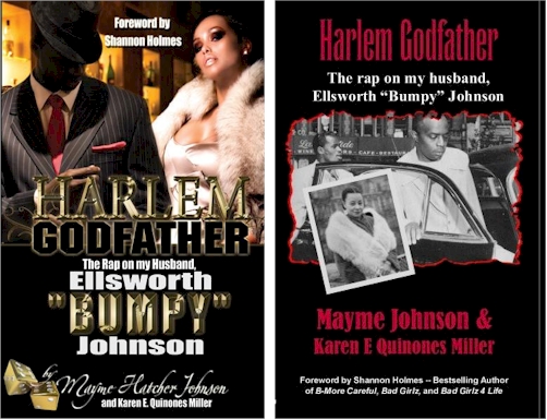
This title was released using both covers. I'm interested to hear why you think. |
Troy
AALBC .com Platinum Poster
Username: Troy
Post Number: 1371
Registered: 01-2004
Rating: N/A
Votes: 0 (Vote!) | | Posted on Thursday, June 26, 2008 - 06:47 pm: |
|
Oh yeah you can learn more about this book and see a video of Mayme Johnson (Bumpy's widow) here: http://aalbc.com/reviews/harlem_godfather.htm |
Cynique
"Cyniquian" Level Poster
Username: Cynique
Post Number: 12381
Registered: 01-2004
Rating: N/A
Votes: 0 (Vote!) | | Posted on Thursday, June 26, 2008 - 07:03 pm: |
|
Since this a a non fiction book, I prefer the cover with the acutal photographs of the people involved in the story. The cover with the graphics tends to distract from the book's authenticity by injecting hype and commercialization into the depiction. |
Emanuel
Veteran Poster
Username: Emanuel
Post Number: 576
Registered: 03-2004
Rating: N/A
Votes: 0 (Vote!) | | Posted on Thursday, June 26, 2008 - 08:57 pm: |
|
The cover on the left is better because it resembles covers of the most popular AA books these days, street fiction. The cover on the left will attract book buyers more than the one on the right. It's colorful, and shiny. The brother looks cool. The woman looks sexy. It makes you want to know what the book is about. It will appeal to a younger audience because they might feel it's something they can relate to.
The cover on the right is in black and white, and the lack of color makes it unappealing. Makes you wonder if you're about to read a boring old memoir. However, it might appeal to the 40+ crowd.
I guess it all depends on your target audience and what is popular at the time the book is released. |
Thumper
Veteran Poster
Username: Thumper
Post Number: 516
Registered: 01-2004
Rating: N/A
Votes: 0 (Vote!) | | Posted on Friday, June 27, 2008 - 01:02 am: |
|
Hello All,
Actually, I dislike both of them. The cover on the left gives the impression that the book is a fiction or a novel. I would expect it on a Nikki Turner book, for example. The cover on the right, simply looks cheap. It screams "cheap, self published book over here". I would recommend using the black and white photos, but use a different layout that solid black and red, makes it look amateurish, like somebody did it using Microsoft Works or something. Check on the cover of the In Search of Nella Larsen cover. It's a black and white photo and it looks better than the one of the right.  |
Rondall
Moderator
Username: Rondall
Post Number: 135
Registered: 01-2004
Rating: N/A
Votes: 0 (Vote!) | | Posted on Friday, June 27, 2008 - 10:06 am: |
|
Choosing the lesser of the two evils, I would go with the one on the right. And when Thumper previously mentioned "cheap" did I think of it as such. I don't care for the self absorbed marketing of the person who wrote the foreword? Honestly, why would you pub the previous works of the person who wrote the foreword? It is a foreword that they most likely got compensated for (i.e. free marketing of the previous works of fiction).
I do imagine that a simple black and white photo of the subject couple or of Bumpy Johnson would be nice. But nice is not necessarily good marketing. |
Carey
Veteran Poster
Username: Carey
Post Number: 866
Registered: 05-2004
Rating: N/A
Votes: 0 (Vote!) | | Posted on Friday, June 27, 2008 - 11:04 am: |
|
I think everyone has just about said it.
Cheap....commercialization...black & white (good)...target audience?....brother looks cool...women looks sexy...the foreword (NOT)....graphics distract (yes)-
It appears to be an enigma. The book on the right has this suspenseful old school feel(yet cheap) but at the bottom there's "Bad Girlz" and "Bad Girlz 4 Life"
The book on the left, as someone said, looks like a book of fiction.
It goes down to the old master..MONEY..who is going to buy the book, who is the target audience? |
Troy
AALBC .com Platinum Poster
Username: Troy
Post Number: 1372
Registered: 01-2004
Rating: N/A
Votes: 0 (Vote!) | | Posted on Friday, June 27, 2008 - 12:29 pm: |
|
I basically agree with Emanuel. The cover on the right is the original cover. I was, honestly, disappointed with the cover when I first saw it. It is simply unattractive; nothing about it would make me want to pick up this book -- other than knowing the author.
Amazingly Shannon's name did not register with me until it was pointed out here. Shannon like Zane draws a crowd so I could see why it was mentioned on the cover. When I publish my first book I will put Zane AND Shannon's name on the cover there could be "Lorem Ipsum"
The cover on the left os much more appealing it "pops". Unfortunately is screams novel, not non-fiction and might be confusing to the reader who picked it up.
Both covers play up "Harlem Godfather", it would seem to me that "Bumpy Johnson" should be more prominent... but that would need to be tested.
Indications on the street is that people are split on the cover, not indicating a strong perference of one over the other.
The first cover was running on the AALBC.com and got a higher than average click through rate. On this measure it is not a "bad" cover.
I just replaced the original cover with the newer cover and I'll let you know if the new cover attracted more interest (based upon clicks and sales).
What cover would I choose? Which ever one tested better with the audience. |
A_womon
AALBC .com Platinum Poster
Username: A_womon
Post Number: 2314
Registered: 05-2004
Rating: N/A
Votes: 0 (Vote!) | | Posted on Friday, June 27, 2008 - 01:01 pm: |
|
Yeah, what Troy and Emanuel said!  The one on the right looks like one of those "true crime" books by ann rule. The one on the right looks like one of those "true crime" books by ann rule. |
Cynique
"Cyniquian" Level Poster
Username: Cynique
Post Number: 12384
Registered: 01-2004
Rating: N/A
Votes: 0 (Vote!) | | Posted on Friday, June 27, 2008 - 02:43 pm: |
|
The sleazy cover on the left compromises the integrity of the book. The collage cover on the right captures the tone of it which is about a bygone era.
The idea that the cover on the right only appeals to people "over 40" is actually a plus since these folks probably buy as many if not more non fiction books than the thrill seekers who exhibit very little appreciation for anything that didn't happen yesterday. |
Chrishayden
"Cyniquian" Level Poster
Username: Chrishayden
Post Number: 7068
Registered: 03-2004
Rating: N/A
Votes: 0 (Vote!) | | Posted on Friday, June 27, 2008 - 03:46 pm: |
|
I would vote for the cover on the right, the one that uses actual photos...which means they probably should use the cover on the left if they want to sell books.
If Bumpy Johnson was more familiar to potential readers his own face would do the trick--much as you would use Al Capone or John Gotti' face..but he's not a household name. |
Afrika
Veteran Poster
Username: Afrika
Post Number: 113
Registered: 06-2006
Rating: N/A
Votes: 0 (Vote!) | | Posted on Sunday, June 29, 2008 - 08:16 pm: |
|
Greetings,
I actually do not like either of them. They just do not appeal to me at all. I will create the photo on the left and then the text on the right. That's my say on this.
Peace
Afrika Midnight Asha Abney |
Vanders
Newbie Poster
Username: Vanders
Post Number: 3
Registered: 06-2008
Rating: N/A
Votes: 0 (Vote!) | | Posted on Monday, June 30, 2008 - 08:00 pm: |
|
Hello,
I'm new to the board and glad to share in the discussion. I agree with the folks that like the book cover on the right. I read the book that had the actual photos on the cover and found it helpful to be able to look at the real faces of Bumpy and Mayme while reading their story. For me when reading biographies,auto-biographies, or memoirs it is good to see the real people. How many times do you read a book and picture in your own mind what the person may have looked like, then someone does a movie and the person doesn't look like you imagine. This is fine for fiction, but let real life look like real life. That's just my thought. Take good care, Vanders |